
By Luke Francl (look@recursion.org), August 2011
d3.js is a data visualization library by Mike Bostock, who is also the primary creator of Protovis, which D3 is designed to replace.
D3 has a steep learning curve, especially if (like me) you are not used to the pixel-precision of graphics programming. To build a visualization with D3, you need to understand JavaScript objects, functions, and the method-chaining paradigm of jQuery; the basics of SVG and CSS; D3's API; and the principles for designing effective infographics.
The pay off is that you can create some amazing visualizations with D3 (just look at the examples!).
I know very little about D3, but the best way to learn something is to teach it...so here is a very simple introduction to D3 from the beginning.
D3 shares similarities with its predecessor Protovis. However, instead of having its own graphical representation, D3 uses SVG (or HTML for simpler visualizations). This means that using D3 requires a fair amount of understanding of SVG. Fortunately, D3 provides a jQuery-like interface to the DOM, which means you will not have to endure the XML situps.
SVG provides basic shape primitives like line, rect, and circle as well as text and path to build complicated lines and shapes. If you think about a bar chart, you can see how you could make one of lines and rectangles with text for labels. D3 provides an API to help you place your rectangles in the correct location on the canvas.
To place a rectangle on the canvas, you need to understand that the axis starts in the top left corner and counts up towards the bottom of the screen. An SVG rect is positioned from its top-left corner and has a width and height.
Here's a diagram of a rectangle positioned at (100, 100) with a height of 100 pixels and a width of 200 pixels.
To produce this with D3, add a container div to the page, and the following JavaScript code.
The result looks like this.
Not very impressive, eh? However, it does demonstrate how to use the D3 API to build an SVG document. The generated SVG code looks like this:
<svg width="400" height="300">
  <rect x="100" y="100" height="100" width="200"></rect>
</svg>
A vertical bar chart (or column chart) is basically a series of rectangles with the sizes proportional to the data being represented. D3 provides scales to translate between the input (your data) and the output (an x or y position on the canvas).
A linear scale is declared like this:
var xScale = d3.scale.linear().
  domain([0, 20]). // your data minimum and maximum
  range([0, 100]); // the pixels to map to, e.g., the width of the diagram.
d3.scale.linear() returns a function which above is stored in the xScale variable. In use, the xScale function maps between data and pixel positions:
xScale(0) // => 0
xScale(10) // => 50
xScale(20) // => 100
In D3, scales can be used two ways to set the position of an element. If the data is a simple array of numbers, the scale itself can be passed to the attr method:
attr("x", xScale)
If the data is more complicated, or if you need to perform additional calculations to adjust the position, you can pass a function to attr. It takes two arguments: datum and index (which are often written as "d" and "i"). Remember that JavaScript functions can accept a variable number of arguments, so if you only need datum your function does not need to take index.
Inside this function, you can call the scale function, manipulate the result, and return it.
attr("x", function(datum, index) {
  return xScale(datum.foobar) + whatever;
})
Using a scale reduces the amount of math you need to do to lay out a visualization, but using them is not required.
In the diagram below, a single rect from a bar chart is represented. The canvas is 300 pixels tall and the width is the number of data points multiplied by the bar width bw. There are two scale functions, x and y.
The x position of the top left of the rectangle is easy: it is x(i) where x is the scale function and i is the index of the current datum. Since the SVG axis is located at the top of the graph, the height h is subtracted from the value of y(datum) to get the y position.
The width is similarly easy, as it is defined to be bw. The height is y(datum).

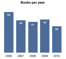
To give a concrete example, here is a bar graph showing books read per year.
To replicate this in D3, you will create a series of rectangles of the appropriate height along the x axis. D3's linear scale will provide functions used to map a data point on the x and y axis.
The data for the chart is a list of JavaScript objects with properties for year and number of books read. Since the years are continuous, there is no need to track them with the data, but doing so makes the code simpler to understand. The technique of using an array of JavaScript objects will be more useful for more complicated data, as you will see below.
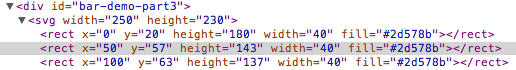
To draw the rects, first use the selectAll method returns to create a selector, then use the data method to binds the array of data objects to the selection. Calling enter on the selection will create any objects that don't have corresponding elements in the data array.
Since there's no existing rects returned by the selector, one will be created for each data element, so it may seem superfluous. However, the selectAll/data/enter sequence can be used to add or remove elements from an existing list. Take a look at the Three Little Circles demo for more about data and enter.
The rest of the diagram all comes down to positioning and formatting.
The result looks like this:
To add numbers inside the bars, svg:text elements must be positioned in the same place as the top of the bar and padding added to make it look right. The svg:text element has a lot of attributes for positioning and formatting. In this example, dx, dy, text-anchor and style are used.
Again, selectAll is used get a selection of elements, data is bound to them with data and then enter is used to add the elements to to the chart.
To add an x axis, the height of the chart must be increased to make room. A padding of 30 pixels will work nicely. By keeping the old height variable and increasing the height of the svg:svg canvas by padding, the rest of the code does not need to change. The axis could be positioned by using height + padding as the baseline, but using translate makes the x and y attributes simpler.
The font has also been changed to closer match the template. This can also be done with CSS, as you'll see in the next example.
And the result:
So far, you would have been better off using Google Chart Tools to produce a simple chart like this. But this barely scratches the surface of what D3 is capable of. A more complicated example will show how you can make custom visualizations with D3 that are impossible with standard charting libraries. This is where D3 really shines.
The goal is to make a chart of day lengths throughout the year, like this one drawn by a child from M&M child care.

This chart has several interesting aspects that are worth noting. It is centered on noon and the length of the day is shown with two lines over the central axis, which forms a shape which is colored in and the background is blue to represent night. There are four labeled axes, top and bottom and left and right. Building a visualization like it is not likely to come from a pre-packaged library.
To plan the attack, a diagram of the desired visualization is helpful.

This brings several points to the foreground:
svg:path for sunrise time and sunset time. d3.svg.area makes this easy.For this example, some new concepts will be introduced:
div and can be transformed as a group.Anti-aliasing helps make text and curved lines look smoother, but can make straight lines appear fuzzy. If you are using a WebKit-based browser, the lines on the left should be fuzzy, while those on the right should be crisp.
Anti-aliasing often happens when drawing straight lines with D3. If the line is 1 pixel tall and positioned exactly on a pixel, it will straddle the pixel and become fuzzy. To avoid it, add or subtract 0.5 to the pixel position. The example below uses this technique to prevent fuzziness.
However, rendering differs depending on the SVG layout engine. In the example above, Firefox 5 renders fuzzy vertical lines when positioned exactly on a pixel, while the horizontal lines are not.
Setting the SVG shape-rendering property to crispEdges disables anti-aliasing for some or all lines. However, this may have unwanted side-effects if the visualization has curved lines, making them look jagged.
svg {
  shape-rendering: crispEdges;
}
A better solution may be to target the crispEdges property at certain (vertical or horizontal) lines with a CSS class.
line.crisp {
  shape-rendering: crispEdges;
}
Using this solution without pixel munging seems to work better across different browsers, but you should test it yourself and see what works best for your audience.
Having game-planned the graphic, the first step is to collect the data. You can find sunrise and sunset times for cities around the world at timeanddate.com. I could not find a source of sunrise and sunset times in a computer-readable format and didn't feel like writing a scraper, so I selected a few days throughout the year for the selected location (Minneapolis, Minnesota).
The data format is like this:
{
 date: new Date(2011, 4, 15), // day of year
 sunrise: [7, 51],            // sunrise time as array of hours and minutes
 sunset: [16, 42]             // likewise, sunset time (24 hour clock)
}
Sunrise and sunset times are stored as an array of hour and minute values. These are used to construct a Date to represent the time of day when plotting.
The JavaScript code for the visualization is below, with comments in line.
Using CSS helps remove duplication from the text formatting attributes: And the final result:Now that the visualization is complete, think of what could be done to improve it. You could label the solstices and equinoxes with exact times, or plot different sunset and sunrise times for different locations against each other, or make a label that shows exact times for the day the user is are mousing over...
The possibilities are endless.
Lest you assume these examples were coded straight through, let me assure you this was not the case. There was a significant amount of trial-and-error coding needed to get them working.
One of the advantages of D3 using SVG as its native graphical representation is that it is easier to debug the WebKit Inspector or Firebug.
This is incredibly useful. You can try it on this page to see how the SVG code for these examples is generated.
Another technique that has been helpful for me is to use console.log in positioning functions. This lets you inspect the datum and index of an element as well as the calculated position for the x or y value. For example:
attr("x", function(d, i) {
  console.log(d);
  console.log(i);

  return x(d.whatever);
})
Now you know about as much about D3 as I do. Obviously, this barely scratches the surface. For more tutorials and resources about D3, read the following articles:
You also need to read about SVG to know what's possible – because with D3, you can do anything SVG can do.
That's it for now. I hope this tutorial was helpful for you.